1. Problem Statement & Context
Insurance penetration in India remains relatively low despite increasing awareness. Digital platforms like Policybazaar aim to simplify insurance discovery and purchase by allowing users to compare policies from multiple insurers in one place.
However, the insurance purchase journey is complex, information-heavy, and trust-sensitive.
Users often explore policies but do not complete purchases, leading to significant drop-offs in the conversion funnel.
Problem Statement
Users drop off before completing an insurance purchase due to information overload, lack of decision clarity, and trust concerns.
Product Goal
Increase policy purchase conversion rate by reducing decision friction and simplifying the policy selection process.
2. Users & Pain Points
Primary User Segments
1. First-Time Insurance Buyers
Characteristics:
- Age group: 24–35
- Limited financial literacy
- First-time buyers of health or term insurance
Pain Points:
- Insurance terminology is difficult to understand
- Fear of hidden clauses
- Unsure which policy to select
2. Value Seekers
Characteristics:
- Compare multiple policies before purchasing
Pain Points:
- Too many policies with small differences
- Hard to identify the best value plan
3. Urgent Buyers
Characteristics:
- Need coverage quickly (medical, travel, tax saving)
Pain Points:
- Long checkout forms
- Too many steps before purchase
3. Understanding the User Journey
Before proposing solutions, it was important to analyze where users drop in the funnel.
The purchase journey generally looks like this:
App Visit → Browse Policies → Compare Policies → Select Policy → Fill Details → Payment → Purchase
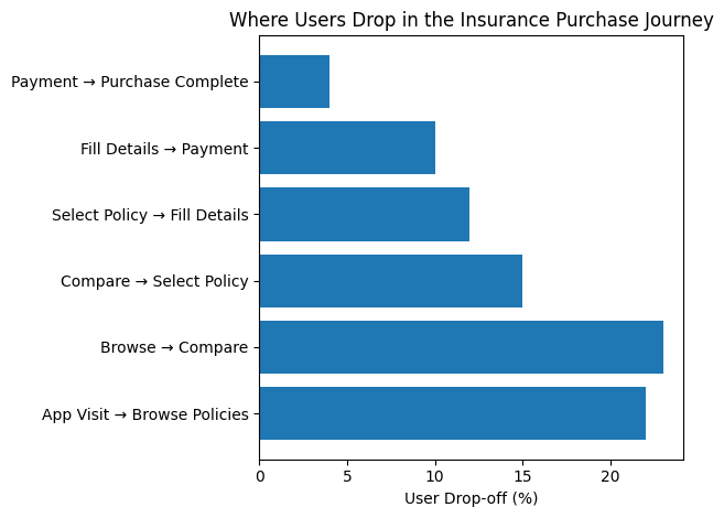
Key Insights
The biggest drop-offs occur in:
Policy Comparison Stage
- Too many plans
- Difficult to differentiate
Decision Stage
- Users hesitate to select a policy
Form Filling Stage
- Long and complex KYC process
This indicates that the problem is not discovery but decision complexity.
4. Journey Friction Analysis
To understand the problem deeper, we mapped the friction level across each stage of the journey.
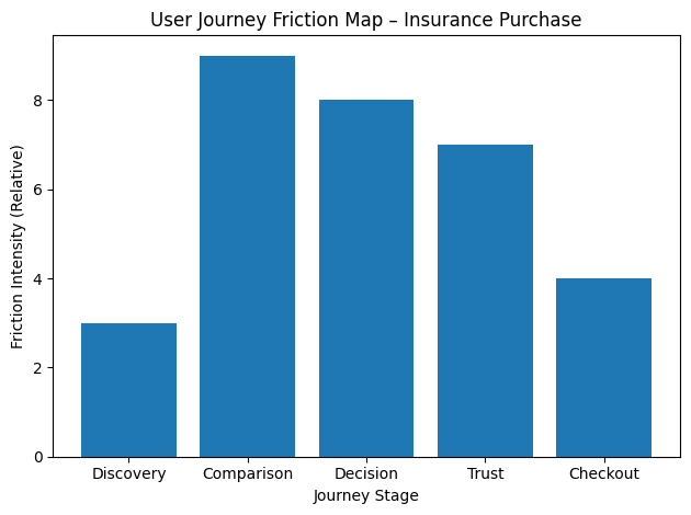
(The friction intensity chart showing comparison and decision stages as the highest friction points.)
Key Insight
The comparison stage creates the most friction because users are forced to evaluate multiple complex policies without clear guidance.
This leads to decision paralysis, causing many users to abandon the process.
5. Options Considered & Rejected
Option 1: Show More Policy Details
Idea:
Provide deeper technical breakdowns of policies.
Why rejected:
- Increases cognitive overload
- Makes decision-making harder
Option 2: AI Chat Advisor
Idea:
Introduce a chatbot to recommend policies.
Why rejected:
- Financial decisions require trust
- Users may distrust automated advice
Option 3: Reduce Number of Policies Displayed
Idea:
Show only the top 3 policies.
Why rejected:
- Removes user control
- Users prefer exploring options
6. Final Solution
Instead of forcing users to evaluate dozens of policies, the product introduces a Guided Insurance Selection System.
The goal is to simplify decisions rather than reduce options.
Solution Components
1. Quick Preference Questions
Users answer a few questions:
- Budget
- Coverage amount
- Family size
- Risk preference
2. Smart Policy Recommendation
The platform processes user inputs and suggests the Top 3 best-fit policies.
3. Simplified Comparison Cards
Policy cards highlight only key metrics:
- Claim settlement ratio
- Premium cost
- Coverage amount
4. Faster Checkout
Improvements include:
- Autofill KYC data
- Reduced checkout steps
- Progress indicator
7. Product System Design
The recommendation flow works like a decision engine that translates user preferences into curated policy options.
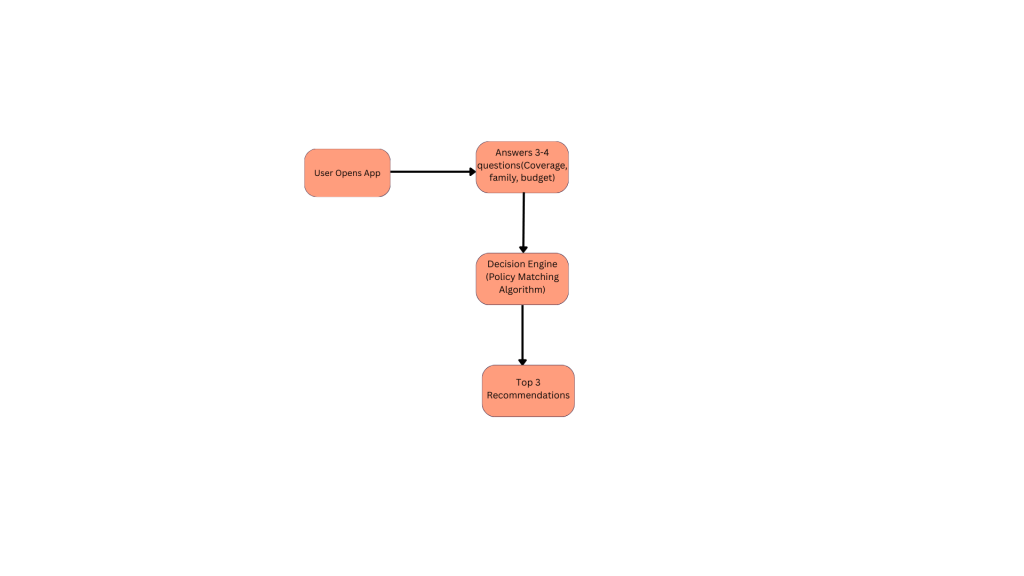
The system flow diagram showing: user inputs → decision engine → top policy recommendations.
8. Expected Impact & Success Metrics
Since this case study is based on a product improvement hypothesis, the results below represent expected outcomes and metrics that would be tracked after launch.
Primary Success Metric
Policy Purchase Conversion Rate
Definition:
Percentage of users who complete a policy purchase after entering the comparison flow.
Goal:
Increase conversion by reducing friction in the decision stage.
Secondary Metrics
1. Comparison → Selection Conversion
Tracks how many users move from comparing policies to selecting one.
Expected Impact:
- Improved decision confidence through guided recommendations.
2. Time to Policy Selection
Measures how long users take to choose a policy.
Expected Impact:
- Reduced decision time due to simplified comparisons.
3. Checkout Completion Rate
Measures how many users complete the purchase after selecting a policy.
Expected Impact:
- Improved completion due to streamlined checkout.
Qualitative Success Indicators
In addition to quantitative metrics, the following user feedback signals would indicate success:
- Users find policies easier to compare
- Users feel more confident choosing a plan
- Reduced confusion about policy features